“THE MEDIUM IS THE MESSAGE” spark 2020 05/12

The Canadian philosopher Marshall McLuhan used the term ‘medium is the message’ to signify content and character.
My father had McLuhan’s book Understanding Media: The Extensions of Man in his library. I occasionally looked at the book in the 1970’s drawn to it by its interesting graphic cover. I confess, I could not make head nor tail of the content but the 2 catch phrases associated with McLuhan (“the medium is the message” and “global village) stayed with me.

Marshall Mcluhan. “Understanding Media The extension of Man” and Quote.
We are rightly captivated by the methods used to convey information. How we communicate with each other defines who we are and constitutes so much of what makes a business unique. Another SPARK reference point is Edward Tufte’s book Envisioning Information a wonderful exposé in how to render 3 dimensional experience into 2 dimensions.

“Envisioning Information” by Edward Tufte.
The graphic medium we use at SPARK is an extension of ourselves and our design language, it extends our thoughts and philosophy to others hopefully with a positive message.

SPARK Graphic greeting cards, selection

SPARK Suzhou Creek Master plan, Shanghai, 2010. Diagram by SPARK.
Below is a selection of SPARK’s graphic work that illustrates the use of our consistent visual aesthetic. Our bespoke method of explaining complex material by visual means. The foundational elements of our work colour, shape and form have become over time a unified system of meaning across our architecture, interior, landscape and graphic work.
SPARK GREETING CARDS
We do our best to mark social occasions sending greetings to our clients and colleagues sometimes they have nostalgic appeal and links to important cultural moments or environmental issues. They are always satisfying to make, and nice visual record of time and events.

2018 Dragon boat festival. Project: kiss the petrol kiosk goodbye

2016 Mid autumn festival card, year of the Monkey

2019, Mid autumn festival. Project: 3 little pigs biogas plant
HOMEFARM SINGAPORE
Client: SPARK

SPARK Homefarm 2014
The typographic language used to support the architecture reflects an “arcane” graphic language a time when we used scalpels and cardboard cut outs, folding and cow-gum, a fun antidote to the digital revolution that has democratised the graphic process. The graphic work below illustrates the development of the brand identity of Homefarm and excerpts from our self-published book written by Narelle Yabuka.


SPARK Homefarm 2014: Wayfinding signage and collaterals developed for Homefarm media conference 2015

SPARK Homefarm 2014: Christmas card ‘how to fold your own homefarm’
GRID SINGAPORE
Client: Gaw Capital

SPARK GR.iD Singapore: Professional Render 2019
SPARK GR.iD on site 30 January 2020
Graphics in fine art terms, was always been seen as a low-grade activity denigrated to the commercial endeavour of those Mad Men. It wasn’t until the 80s with guys like Neville Brody of the Face magazine, Peter Saville of Factory Records fame and the very graphic interior of Manchester’s Hacienda by Ben Kelly that I started to think about its potential seriously. At GR.iD we have developed the projects visual identity including the building logo and youth focused 2 and 3 dimensional graphic artworks used in the building interiors encouraging a social media connections between the GR.iD brand and its audience.
At GR.iD we have developed the projects visual identity including the building logo and youth focused 2 and 3 dimensional graphic artworks used in the building interiors encouraging a social media connections between the GR.iD brand and its audience.
Bespoke wayfinding icons for GR.iD by SPARK


SPARK GR.iD Singapore: Graphic design, wayfinding and applications in interior design.
YES
Client: YTL

SPARK Yes flagship store 2010: A digital installation
The experience of the Yes brand launch for YTL is a little like being immersed in Tetris, you’re very much part of the experience. The graphic diagrams attempt to describe this sensitivity, the connection to the “game” type environment mischievously co-opting commercial shopping language as the medium this online space, that invites customers to explore alternative digital spaces with online connections via the Yes network into a virtual reality and a way to explain the brand content with imagination.


SPARK Yes flagship store 2010: Early conceptual diagrams and rendering
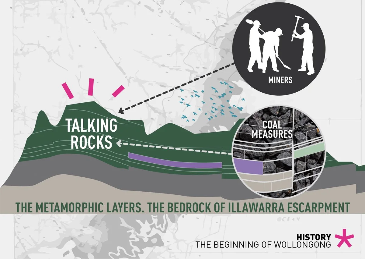
GATEWAY WOLLONGONG
Client: Gateway Wollongong Pty Ltd

SPARK Gateway Wollongong 2012: Aerial perspective
The graphic diagrams illustrated are part of the project story telling reflecting societal moments in the development of Wollongong and its location next to the ocean.
The images we believe are a powerful tool, they have no barrier of entry, like perhaps the architecture. They are memorable images reminding us that when you want the project’s origins and raison d’être to be told, there’s nothing quite like ink on paper to capture attention.


SPARK Gateway Wollongong 2012: Early conceptual diagrams and collage