SPARK FACADES, THE DECEPTIVE OUTWARD APPEARANCE
Walter Gropius in his Fagus factory project of 1913 became the first architect to successfully design a “curtain wall” a filigree facade that had no load bearing function. Gropius along with Mies Van der Rohe and other modernist architects liberated the building skin from the structural frame paving the way for advances in façade design technology.
Gropius describes the transformation as:
“The role of the façade is restricted to that of mere screens stretched between the upright columns of the framework to keep out rain, cold and noise.
The façade design of buildings resolves aesthetic and environmental issues that facilitate the enclosure or screening of habitable space that in turn creates a comfortable environment for its occupants.
Façade design, beyond the pioneering work of Gropius and Mies is increasingly focused on environmental moderation; SPARK couples this contemporary environmental paradigm with thoughtful design that makes our buildings work effectively for their owners and the environment.
Since its inception SPARK has been involved in many projects where the building’s skin has not only contributed to its environmental performance but has also helped define its value, its expression in terms of creative intent and its contribution to the public realm.
SPARK’s Clarke Quay our first project in Asia demonstrates how intelligent and thoughtful design can balance a project’s commercial prerequisite with sustainability to create a convivial iconic destination.
The social and environmental lessons learnt at Clarke Quay continues to underpin a SPARK palimpsest and is demonstrated in a number of projects undertaken and in development by our studios that follow the Vitruvian principles of firmitas, utilitas and venustas (durability, performance, beauty).
We do not believe that the liberation of the building skin absolves the architect of their obligation to the building plan, section and internal environment, even though some architects make careers out of the design of form swallowing function wrappers of undetermined space.
The following illustrated projects bear testament to SPARK’s ability to achieve thoughtful award winning architecture that creates commercial value for our clients and social and environmental sustainability for the cities in which SPARK works.
SPARK’s new mall for Thaihot in Fuzhou demonstrates its two public faces, the fast face: the iconic civic facing animated commercial facade and the slow face: the human scale tiered façade that forms a backdrop to the shopping street.
Both facades articulate the requirements of their disparate location and function via their mass and materiality.
The civic façade uses a palette of duo-tone aluminum cassettes to form its voluminous tessellated surface that is punctuated with a multi-sensory media wall and other advertising screens.
The street façade of terraced shop fronts illustrates SPARK’s innovative design through the visual and physical connectivity of the city urban grain with the building interior layers that are exposed and linked to the street, the nature of the space it engenders is a lively and fun city destination for shopping and entertainment.
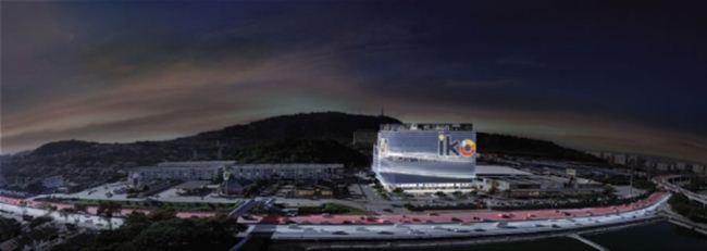
Ikon Connaught is located at the heart of Cheras where the metropolis of Kuala Lumpur begins to merge with the lush green hills of Kajang and Ampang.
Ikon has been designed as a lifestyle destination on an intimate neighborhood scale with the level of quality, impact and vibrancy of a city centre destination. In addition to its human scale the project enjoys a highly visible and prominent location at the crossing point of the middle ring road and the east west link that connects the centre of KL to the Silk Highway and beyond.
Ikon’s facade has been specifically designed to announce the scheme to the millions of people who pass the site on a regular basis whilst serving the community and its immediate neighbours; UCIS University and Connaught Hill gardens.
The façade is an iconic city landmark to the motorist passing along the highway at 100kph, its imagery is therefore very clearly defined; inspired by the owners clothing and luxury goods business the facade explores the idea of an outer layer concealing a contrasting inner skin like a demure leather bag or woolen suit which opens up to reveal a vibrant inner lining.
The inner skin is conceived, as a simple graphic box whilst the fluid outer skin constructed from aluminium tubes appears to open up and flow with the passing traffic. Ikon provides space for more than100 boutique shops and restaurants over five storeys with five levels of office above. The dynamic skin flows into the landscape wrapping the project with a veneer of outdoor dining terraces screened by layered planting.
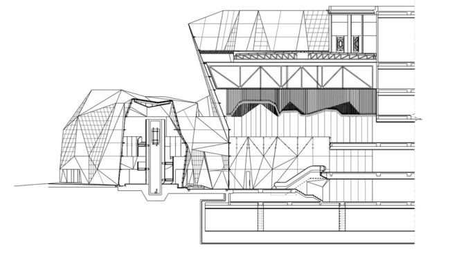
Starhill Gallery is one of Kuala Lumpur’s premier shopping malls featuring an extraordinary array of luxury branded goods and fine dining restaurants. Spark’s proposal deals with the reinvention of the façade of Starhill facing Bukit Bintang as urban sculpture engaging with the public realm and the pedestrian. A new pleated skin in glass and stone inspired by the tailoring of Christian Lacroix’s theatre costumes wraps the existing building to create a striking new identity. The prefabricated lightweight steel and glass façade that shrouds the old solid and impenetrable Starhill facade is the first of its kind in Malaysia; the crystalline form of the façade and pavilion establishes a new identity for Starhill Gallery reaffirming its position as the foremost destination for luxury shopping in Southeast Asia
The fractured variation of solidity and transparency transforms the street façade of the existing building entirely, giving it a new contemporary classic identity that stands out amongst the quick-fix, ubiquitous shopping mall façades of many of Starhill Gallery’s neighbours.
Spark’s lightweight steel, stone and glass façade embraces cutting-edge façade technology from the French engineer RFR, the team that delivered the Pyramid at the Paris Louvre.
Spark replaced the café at the entrance of Starhill Gallery with an iconic triple height shopping pavilion for the French luxury retailer LVMH and their cosmetics brand Sephora. Sephora is, in turn, connected to Starhill via a first floor bridge that pierces the new crystalline façade.
Spark, deliberately crafted a complex building envelope using only the best materials that resonate with the importance of the building’s position and contribution to the streetscape of Kuala Lumpur. The synergy with high quality of the brands/products, as well as special visitor experience inside Starhill Gallery.
Raffles City Ningbo
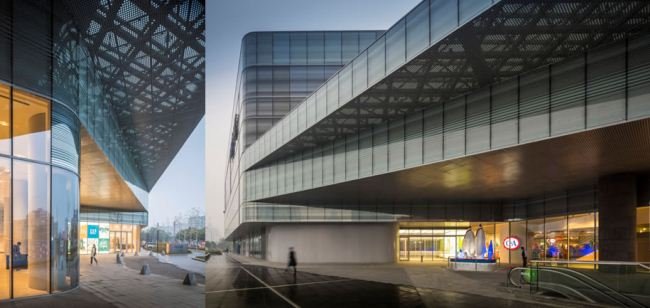
This 150,000 sqm mixed-use development includes office and serviced residence towers and a retail podium. The building façades respond to two distinct contexts: a public façade providing the interface of the retail podium and office tower with the city and a layered retail façade interfacing with a community square and adjacent residential development.
The retail podium sits at the intersection of two main city roads: South Daqing Road & Jingjia Road; here the street facing “Fast Express” retail façade interfaces with the city, emulating the speed, power & image of an expanding Ningbo CBD. The horizontal striped partial frit on the glass façade and the playful distribution of gradients enhances this go faster “Express Effect”.
In contrast the retail podium façade facing the community courtyard, the “Soft Zone”, is layered in a topographical manner reducing the apparent scale of the building in relationship to the human scale and character of the courtyard.
A vertical winter garden is cut through the South façade of the 15 storey office tower, adding a unique element visual element that increases the natural flow of air through the building and provides key views from the tower towards the river adding dramatic outdoor space to the office communal environment. Balconies with sky gardens are located at every third level providing additional shading reducing solar gain.
The office façade is a combination of clear glazed vision panels, translucent fritted glass panels and panels with solid infill. The solid panels provide a 50:50 ratio of solidity and transparency that reduces the building heat load, sustaining the highest possible environmental standards for the façade and its associated systems.
The serviced residence tower stands alone adjacent to the retail podium and community courtyard. It houses 160 luxury apartment units, 1 level of clubhouse/sports facilities and a ground floor lobby that provides business facilities as well as fine dining restaurants for the residents and public enhancing Ningbo’s position as a destination for high-end living.
The southern façade of the serviced residence is composed of long, slim and elegant strips of balconies that take advantage of views toward the river, the balconies gradually morph into sleek ribbons that echo the topographic design of the adjacent retail podium, this design “leit-motif” is carried into SPARK’s landscape design which in turn binds the disparate components of the project together in a unified and consistent design approach.
Wanda Plaza is located at the southwest corner of Xinhua Avenue and Tonghui South Street in the Tongzhou District of Beijing. Tongzhou is regarded as being Beijing’s next “international new city satellite” confirming it as a key district of growth with emphasis on high-end commerce, tourism and cultural entertainment.
SPARK’s design for Wanda Plaza responds to its context by creating a symbol that reflects the city’s advancement and growth, functioning as a focal point for leisure and commerce.
The development comprises; a retail mall with an adjacent retail street, three grade A office towers, and a SOHO office tower, Wanda Plaza will provide the city with a iconic landmark, one with an appropriate human scale where functional ambiance is prioritised to create a convivial environment and an appropriate extension to the burgeoning urban realm.
Historically, Tongzhou was a water city where life in all its facets revolved around the Grand Canal. This “circle of life” its ebb and flow ‘became the inspiration for the design of the building façade, the contextual flows i.e. wind, water, traffic are used to sculpt the building mass into a curvilinear hull.
The building skin wraps around the retail podium creating a lucid and dynamic visual landscape that attracts attention and shepherding pedestrians through the perimeter landscape towards the main entrances.
To facilitate the delivery of this “contextually flowing” façade SPARK is working with façade engineers to optimise the geometry to meet local technical and environmental considerations and the project cost plan.
A form finding analysis has been used to reduce the quantity of double curved panels and associated moulds to below 2% of the façade area.
The twisted edges of the office tower curtain wall facade have been designed to comply with the maximum permissible deflection of a DGU glass panel to be cold formed insitu, this guarantees a consistent undistorted appearance with the reset of the office tower façade
Using this “cold bent technique” introduced in 2000, SPARK fuses technological design excellence with a sleek aesthetic that maintaining maximses views for the tenants.


